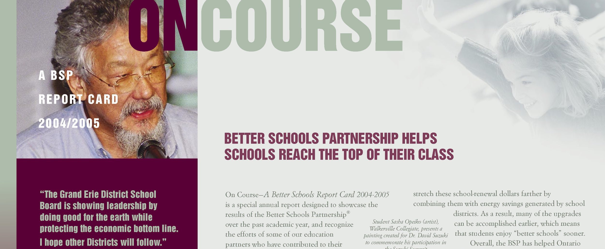
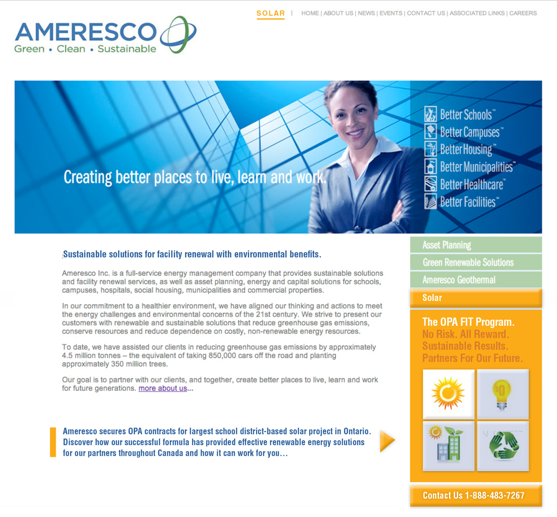
BRANDING Example 2 : COMPLETE BRAND UPDATE, WEBSITE, ONGOING COMMUNICATIONS CAMPAIGNS, EVENTS AND MORE FOR AMERESCO CANADA’S, BETTER SCHOOLS PARTNERSHIP.
We were hired to be part of this amazing visionary team searching for ways to manage resources and invest in renewable energies for the future educational learning and working environments.
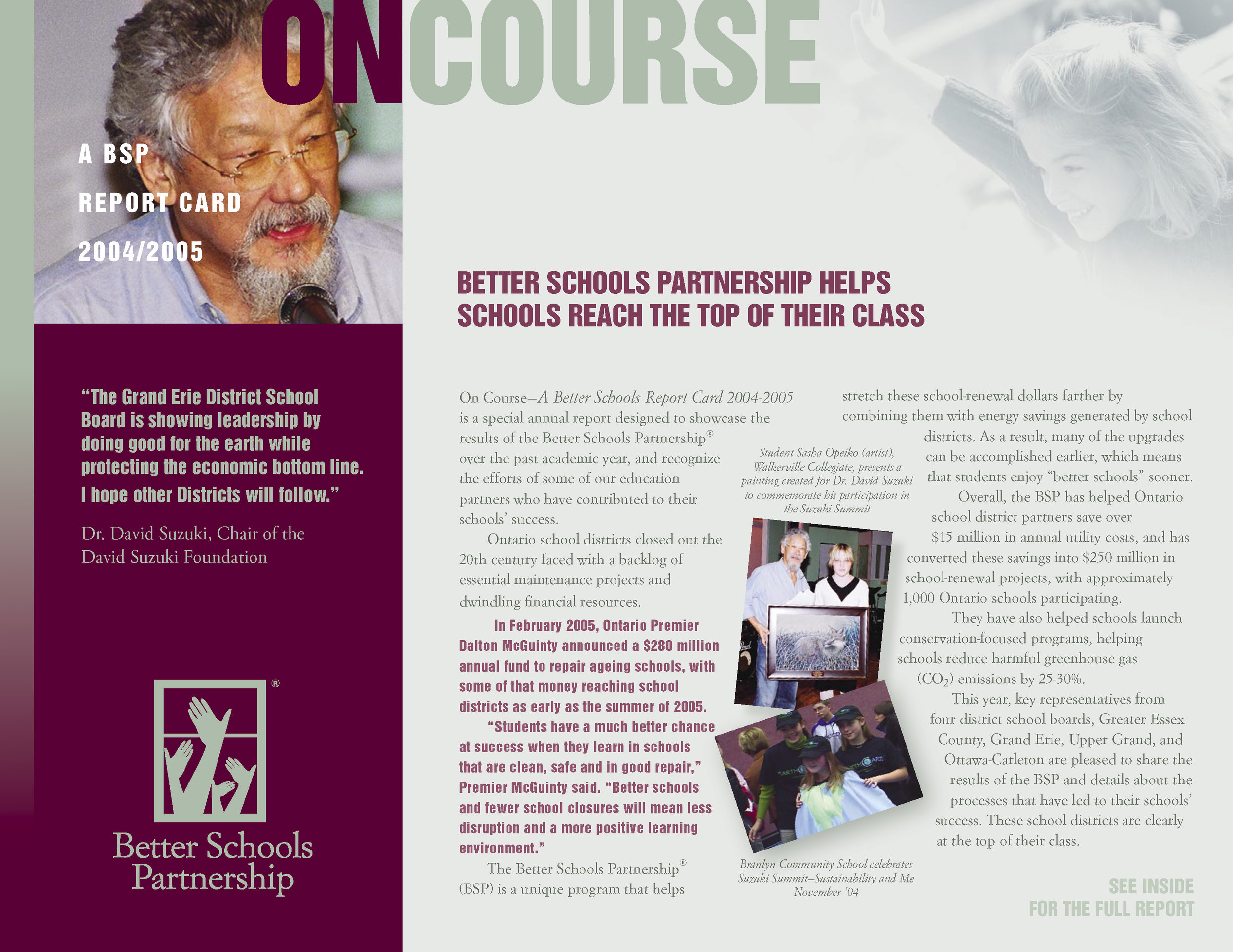
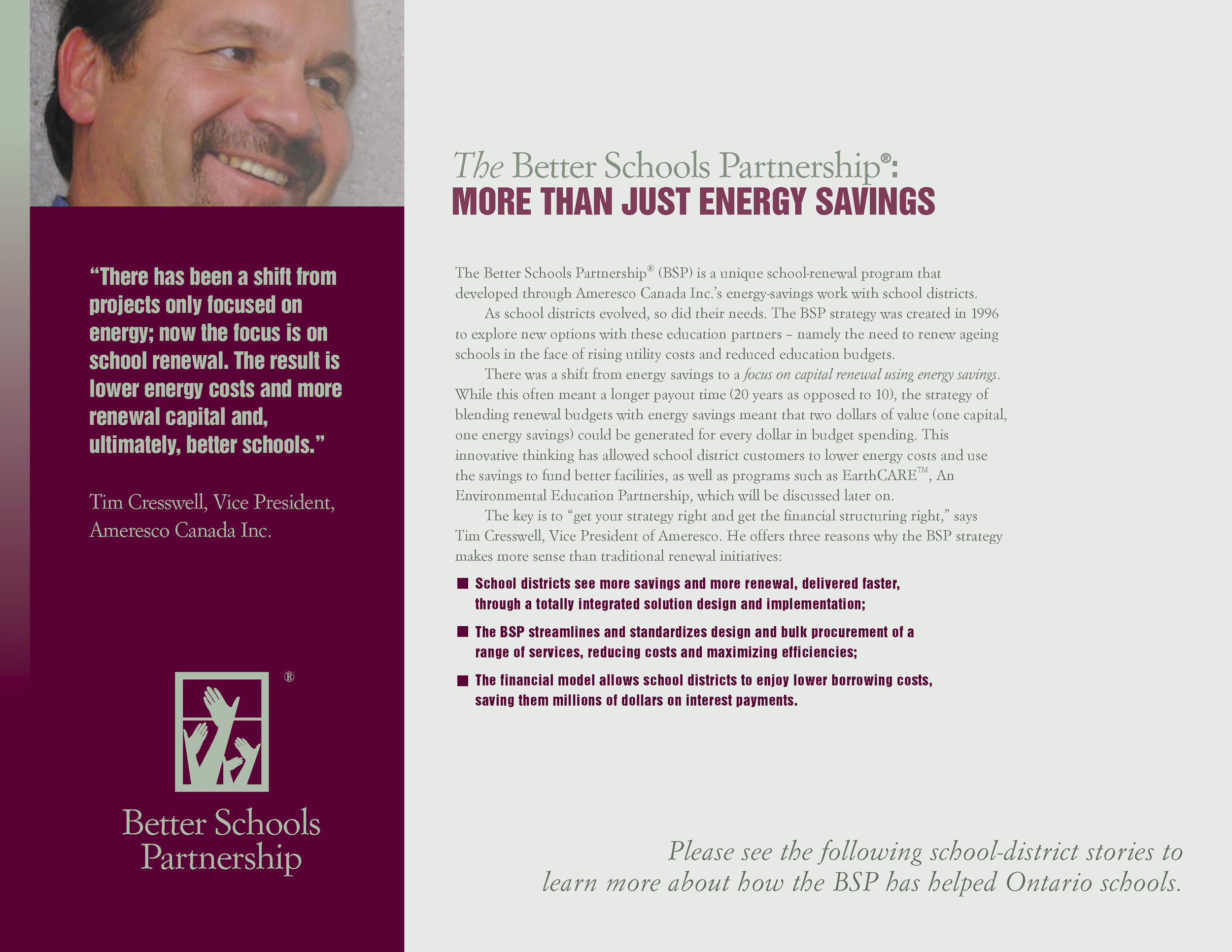
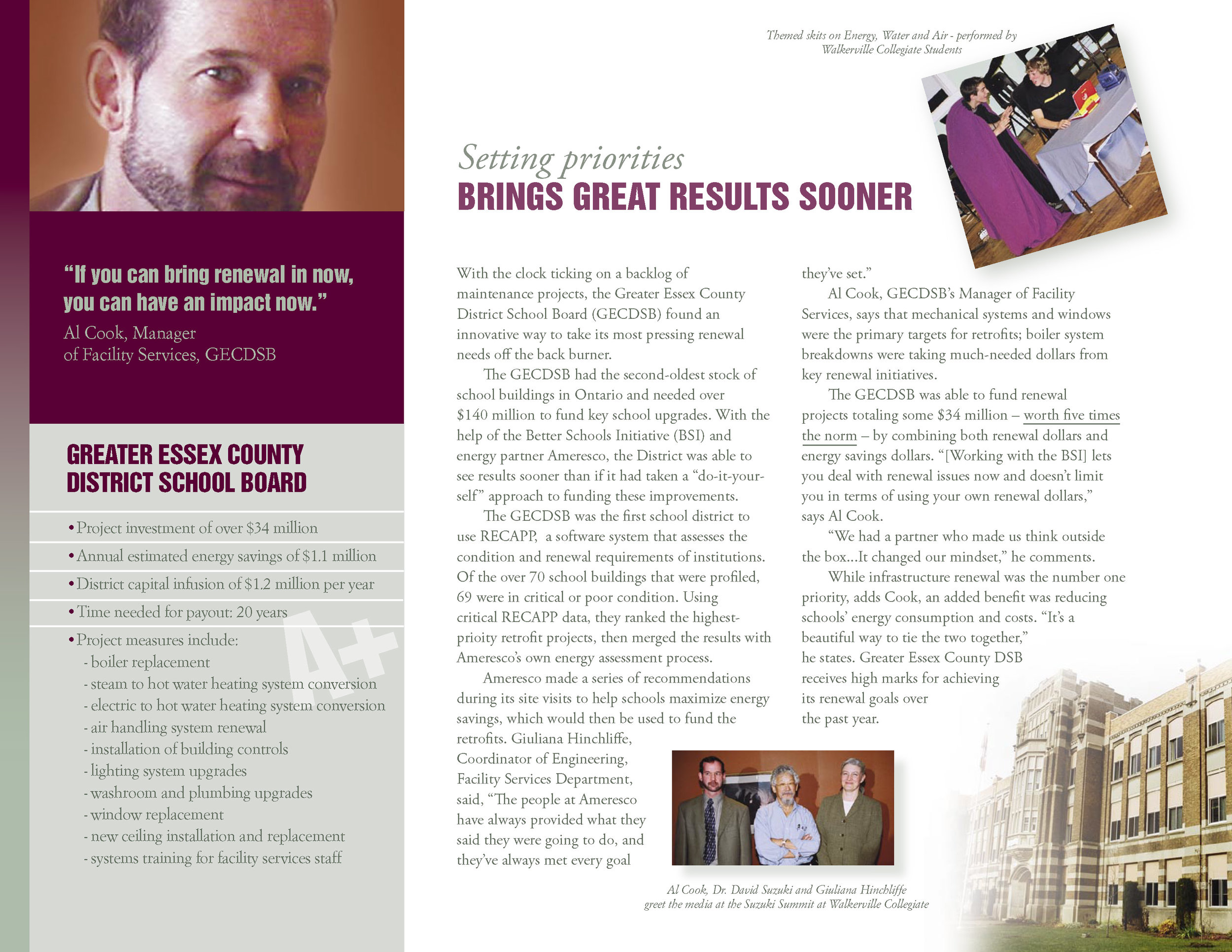
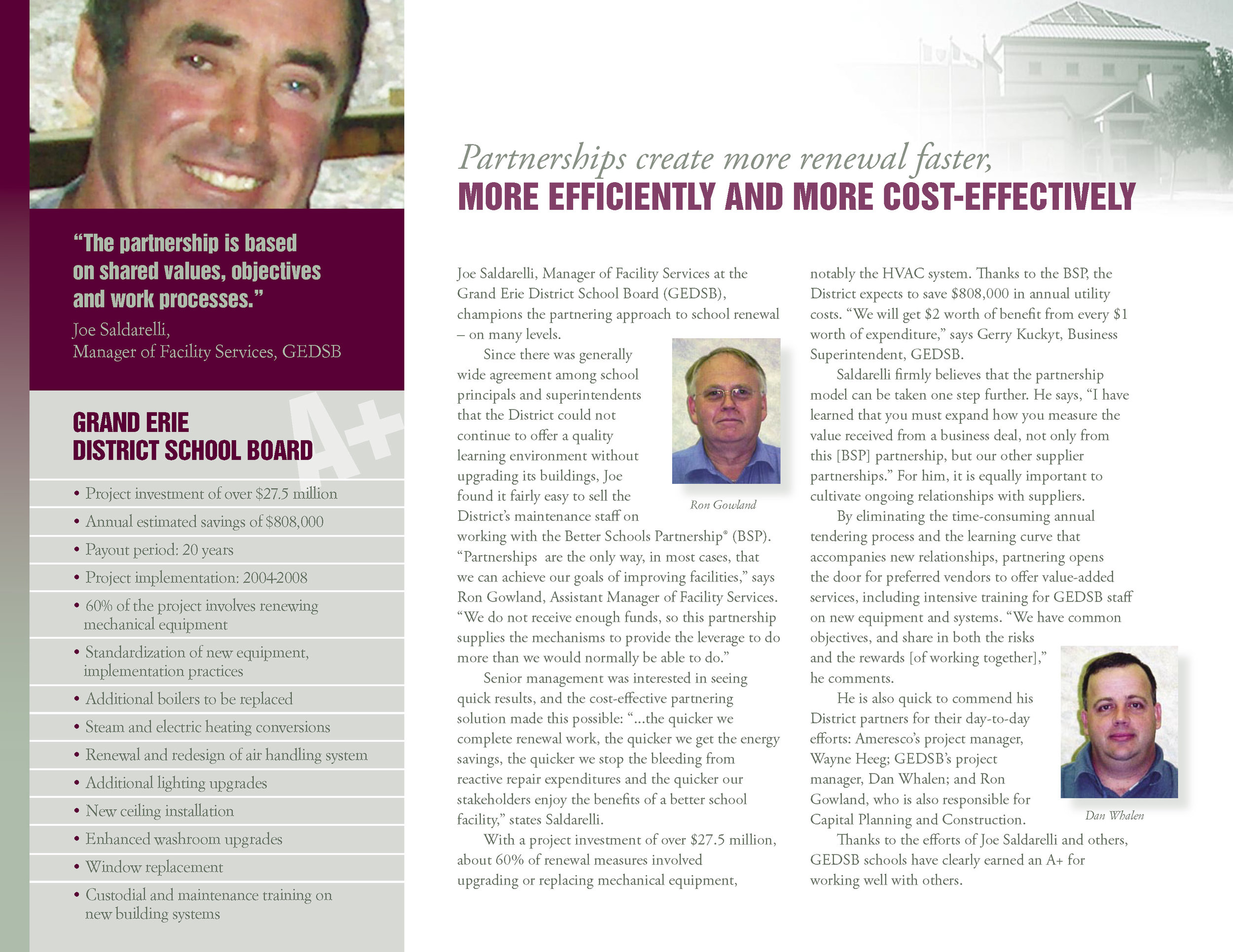
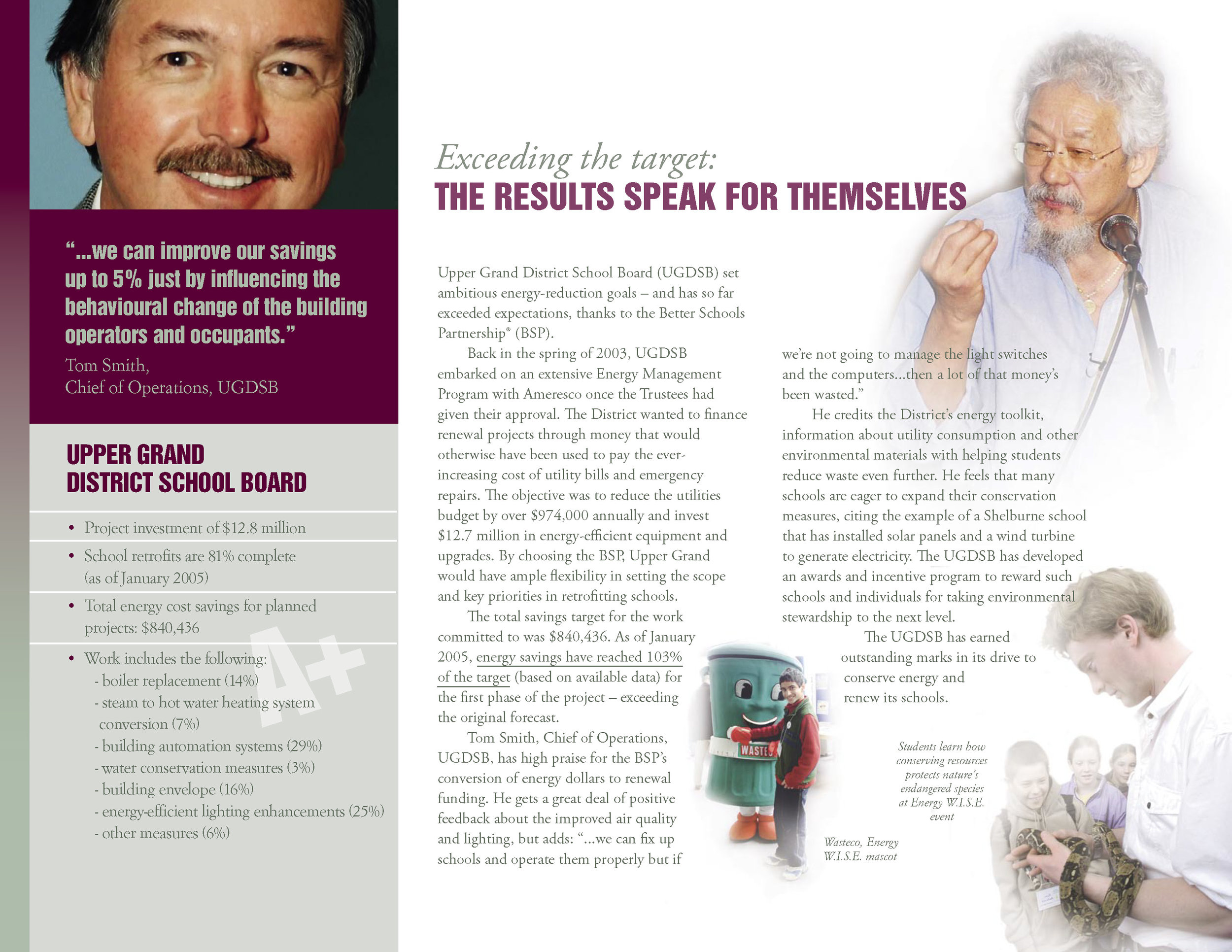
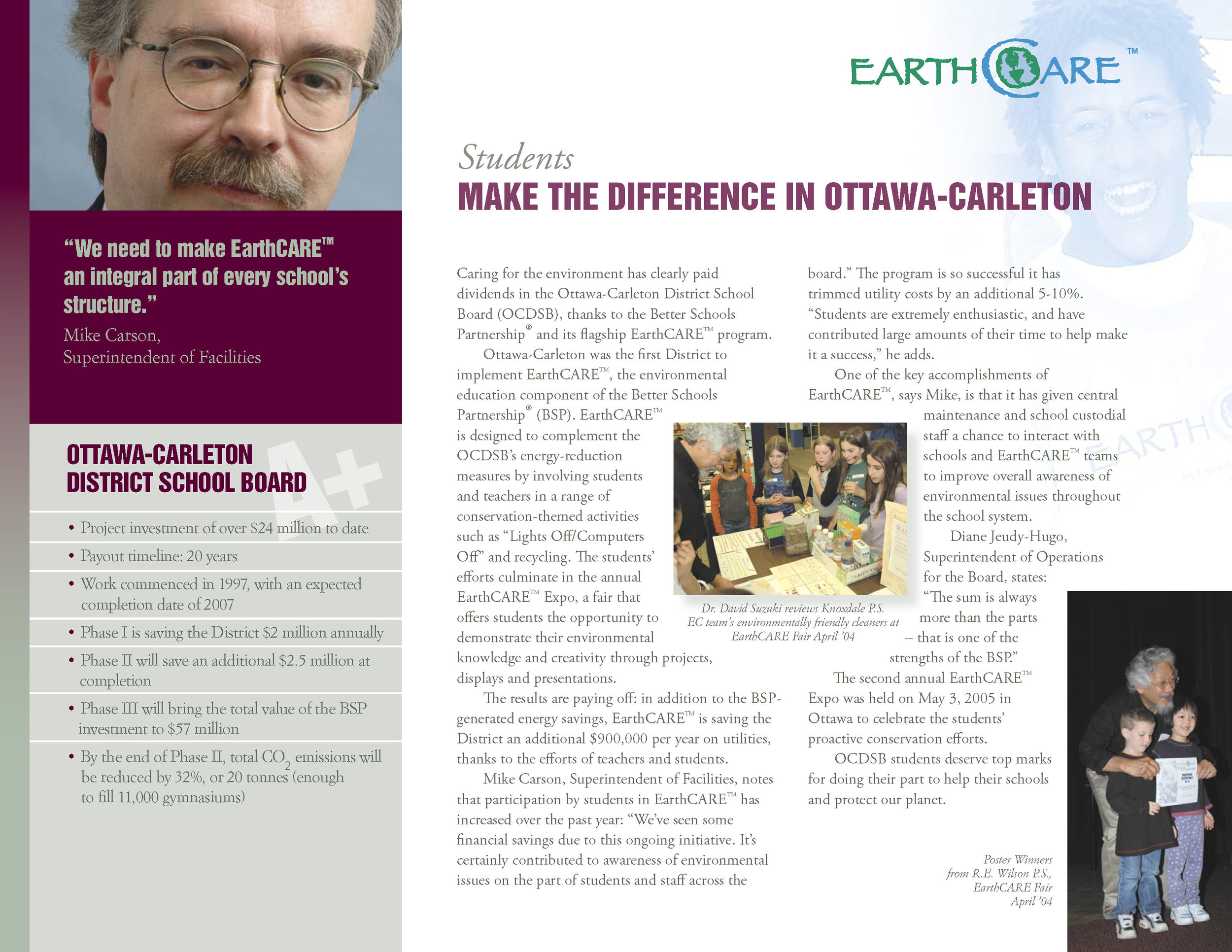
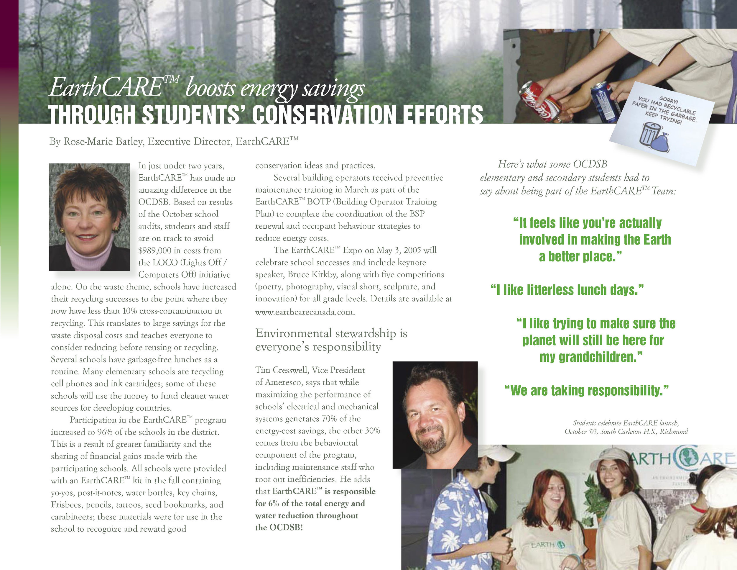
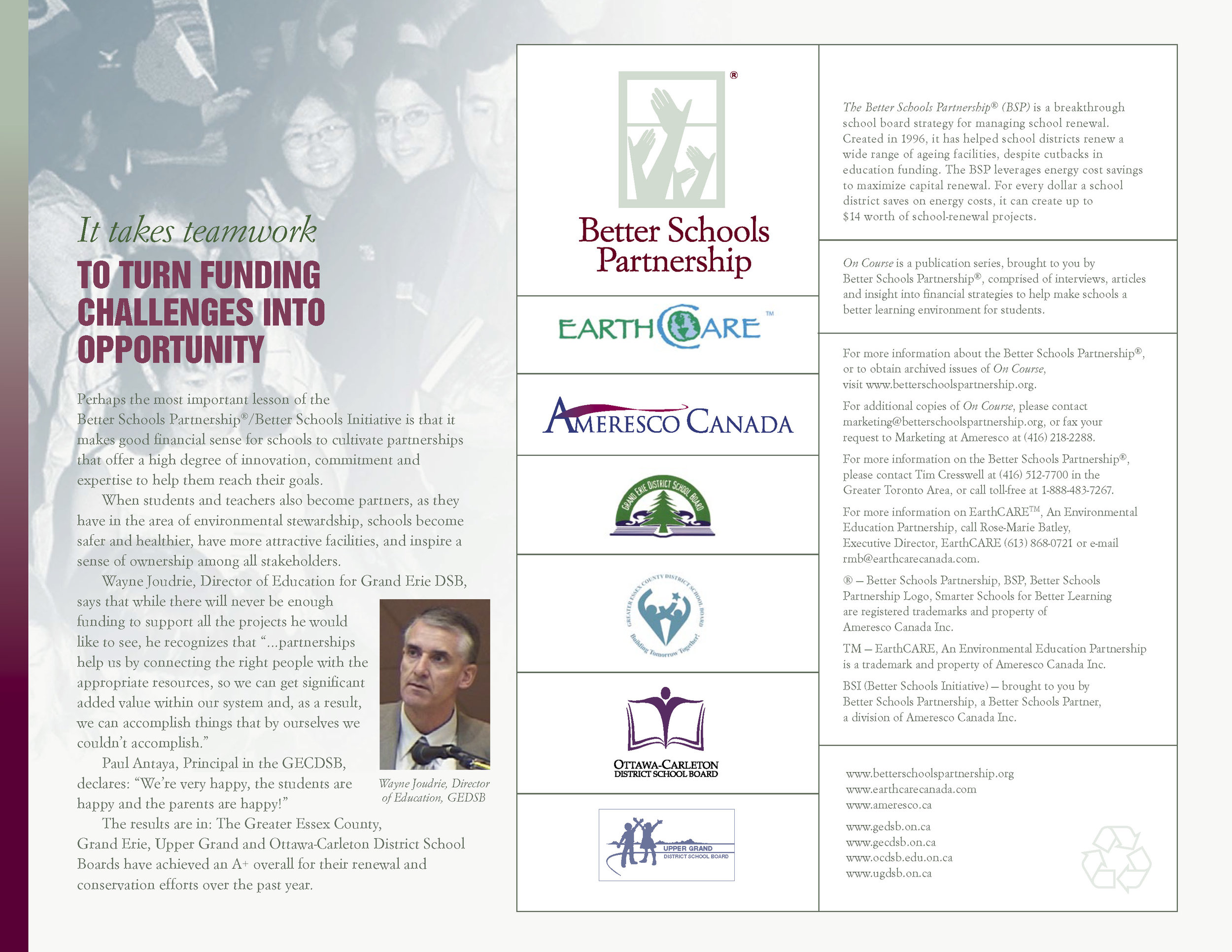
The story below is an example of branding and visual storytelling that, Attracts, Excites and Motivates the audience. It starts with creating a brand logo that is unique to your story. Our solution showing hands raised in a classroom or working environment with the name Better Schools Partnership, reinforces the benefits of the program. Supporting the promise in the logo, is provided by a strong facts and proof of the results newsletter titled ONCOURSE showing Dr. DAVID SUZUKI, students, teachers and custodians all working together at Ontario schools, putting together the start of something wonderful to be part of.
The newsletter is full of results of the energy savings programs with lots of detail and a design language that draws the eye and makes details fun to read from start to finish. Motivating readers to become part of it.
This three panel pop up banner display show the power of one overall promising image that supports the beautiful message.
( This display image is also a good example of how individual stock photographs can be composed to be a very real story representing your vision for the future. Can you tell how many were used? )
Imagine communities of the future:
Living, Working, Learning Environments Connected, Healthy, Sustainable.
Ameresco, Energizing a Sustainable World.
